A conceptual rebranding for Primavera Sound festival in Barcelona, inspired by the visualization of sound and the way it moves through both physical matter and human experience.
The process began by merging two visual worlds: the geometric patterns of Barcelona’s iconic pavements and the organic, fluid forms created by a Chladni plate, a device that makes sound waves visible through vibration. This combination led to a visual language rooted in typography, yet constantly in motion, echoing the flow of people moving between stages, sets, and sounds throughout the festival.
The branding system was implemented across various formats: official website, motion and print posters, social media campaigns, and festival merchandise.
Year 2025
# Image-making, typography, motion graphics,
web design, branding

The festival logo in its stripped-down, foundational form — the basis for all visual variations.
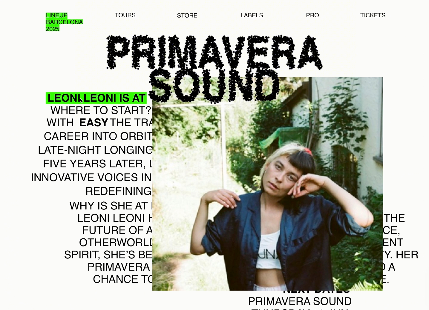
A quick overview of the website created as part of the branding project.

Motion poster.
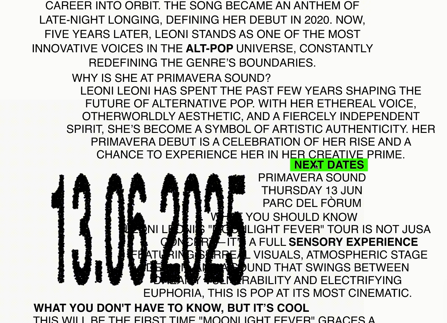
The disintegration of the typography is designed to evoke the movement of people between stages at the festival, the hustle, the liveliness combined with a visual reference to sand shifting in response to sound vibrations.
Selected frames from the “Artists” section of the website, accessed through the Lineup tab. The screen aims to deliver key information while immersing the user in the artist’s world, the event’s visual language, and overall vibe.

A glimpse into the printed merch and festival posters, reflecting the overall branding atmosphere — one that leans into zones of organized chaos.
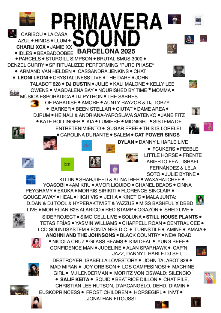


A series of printed lineup variations — from the full informational format to a stripped-down version focused solely on spotlighting the festival’s headliners.


Two flyer versions presenting an artist performing at the festival.
The branding as a whole is built on varying levels of visual density and abstraction — some materials are rich and layered, featuring typography, imagery, color, and extensive information, while others embrace a minimalist approach, using only the basic logo and a typographic system composed of simple, scattered black-and-white circles.